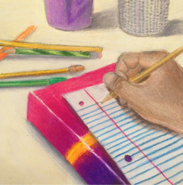
For my 5th concentration piece, I did a prisma color drawing of my homework. First of all, this piece is actually really small in person because I did not have enough time to really do a big piece within the timeline. If I had more time, I would have liked to do a bigger piece. Other than that, I really enjoyed putting the colors of the textbook in the drawing because it was so bright and colorful and gradient. It was difficult, though., to draw the lined paper with prisma color because it is hard to make sure that the colors do not blend. It was even more challenging for me because I started with the blue first and then I added in the white back color between the small blue lines. I also had a hard time finding the right skin color for my hand in the drawing. Eventually, I was adding too much prisma color that the paper became kind of glossy and it was hard to go over. I still don't really like my hand in the drawing because it just doesn't look real in any way and you can see some of the pencil marks.
I feel like I could still add more to the piece like more pencils and more highlights and shadows but I honestly need to move on to my next pieces. Overall, I don't think my piece turned out that bad, the colors look good and so does the value.
I feel like I could still add more to the piece like more pencils and more highlights and shadows but I honestly need to move on to my next pieces. Overall, I don't think my piece turned out that bad, the colors look good and so does the value.
 RSS Feed
